brand kit
Design Objectives
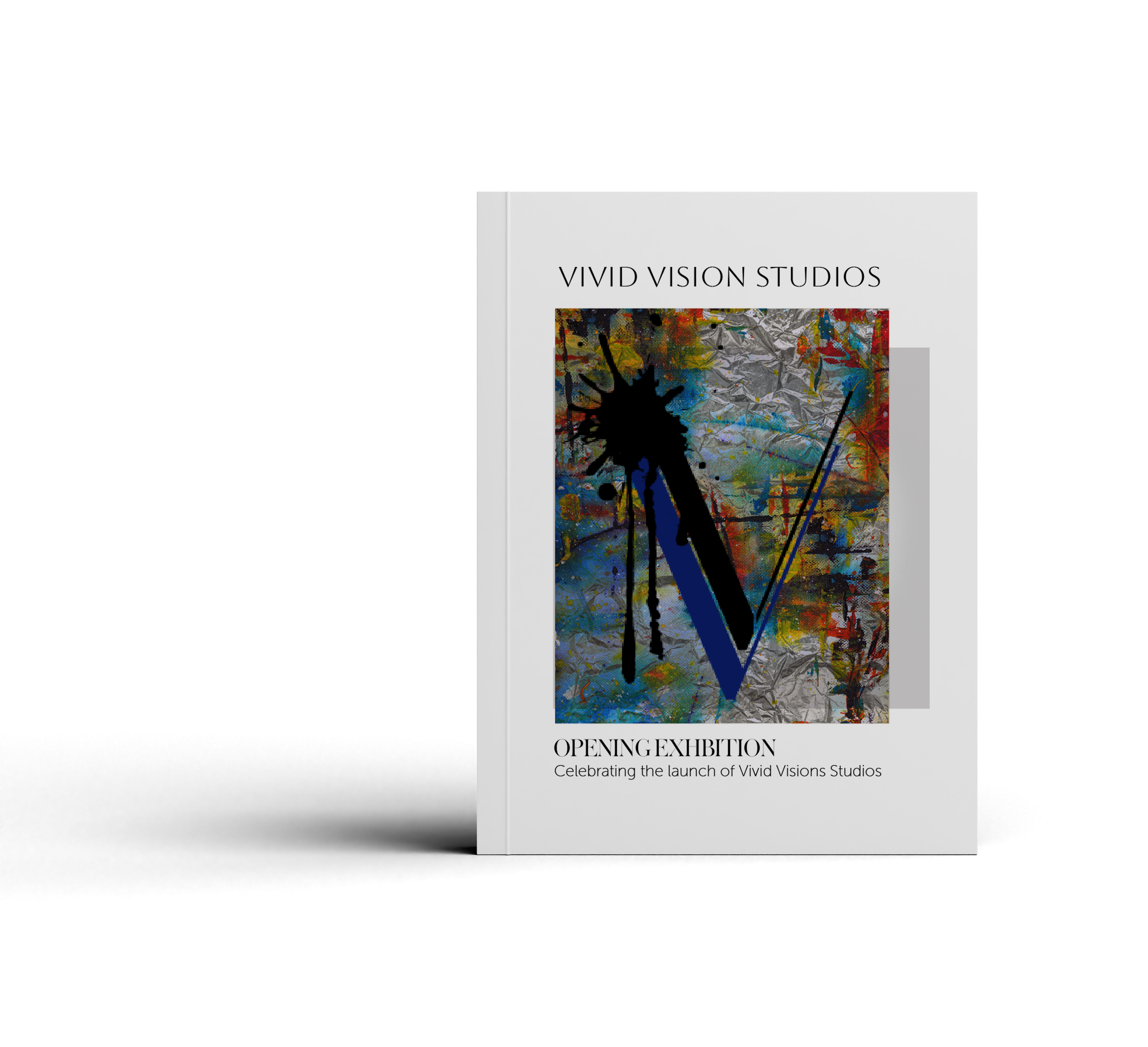
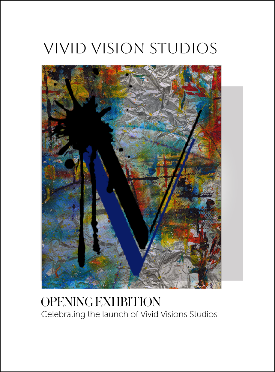
Create a gallery identity that feels contemporary and approachable.
Let the artwork remain the primary focus across all touchpoints.
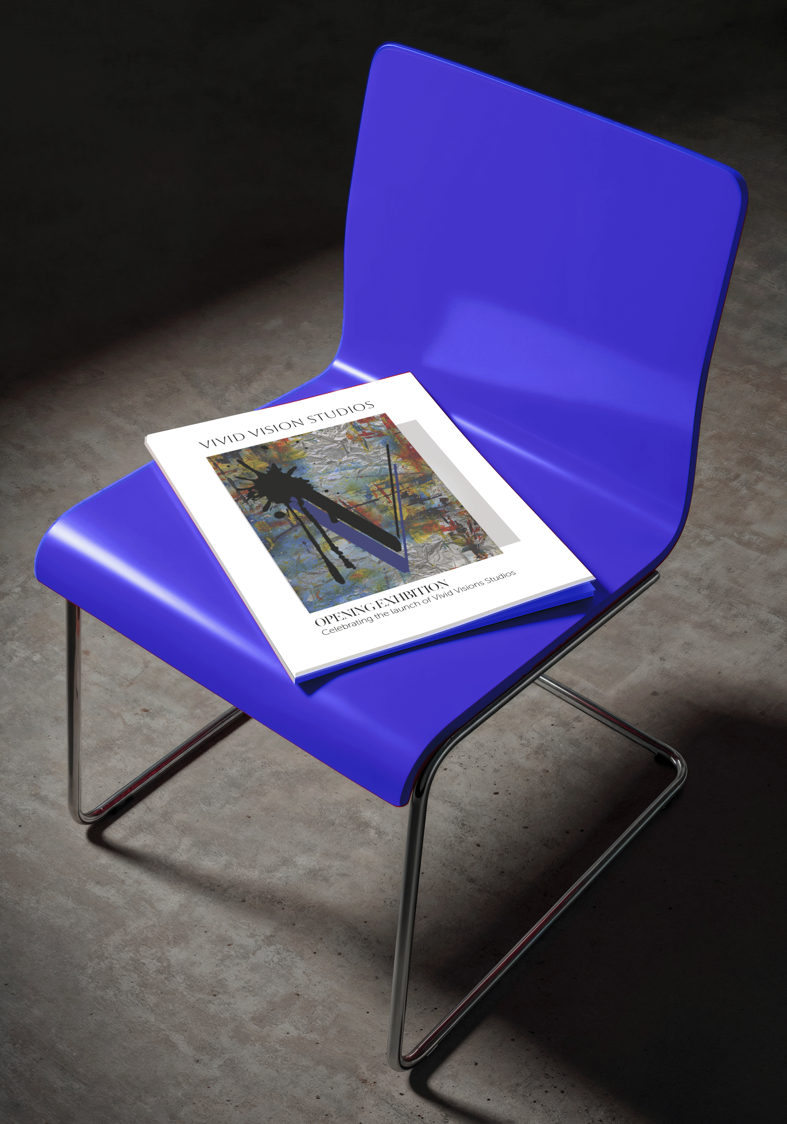
Build a flexible visual system that works across print, signage, packaging, and digital platforms.
ABOUT the brand
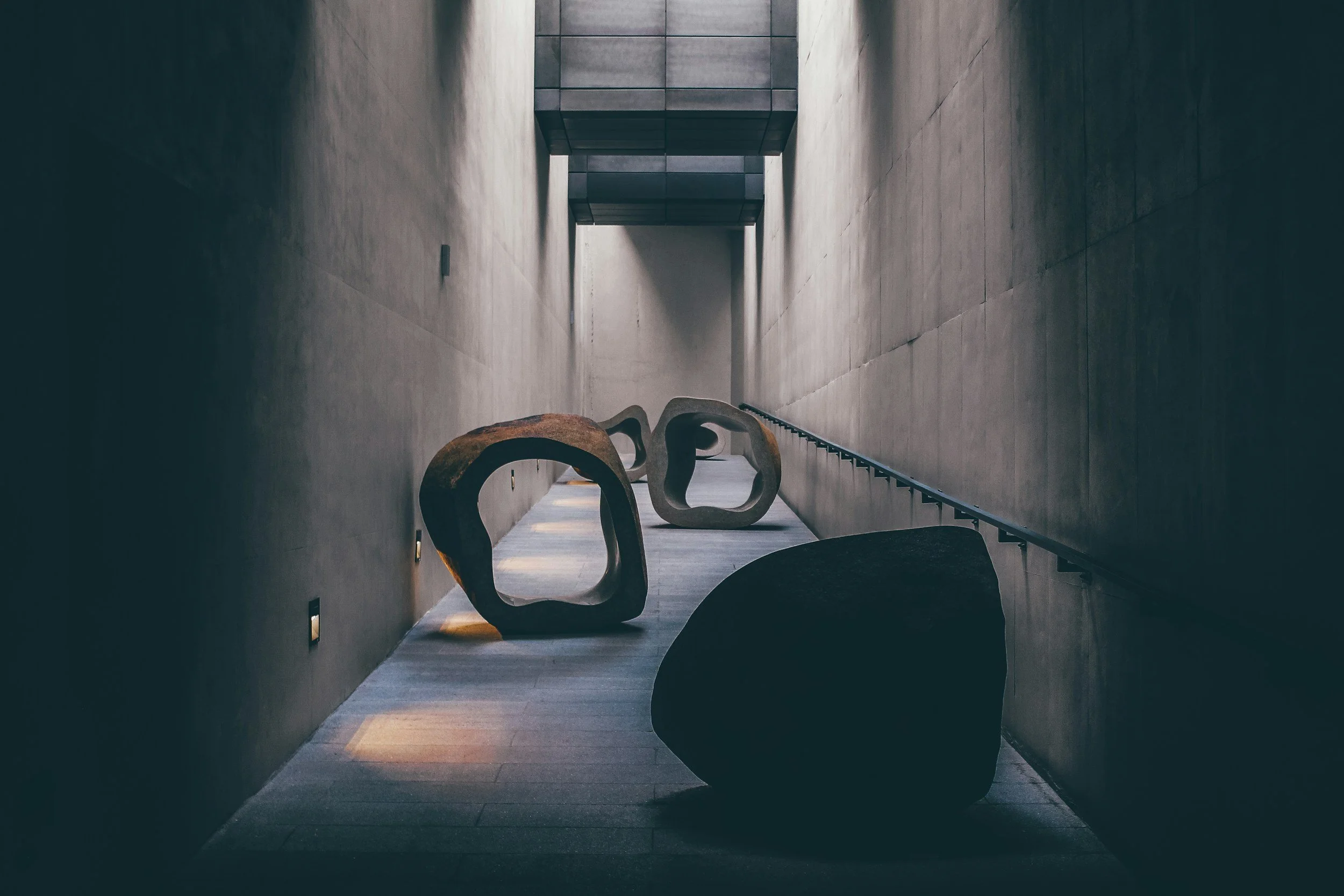
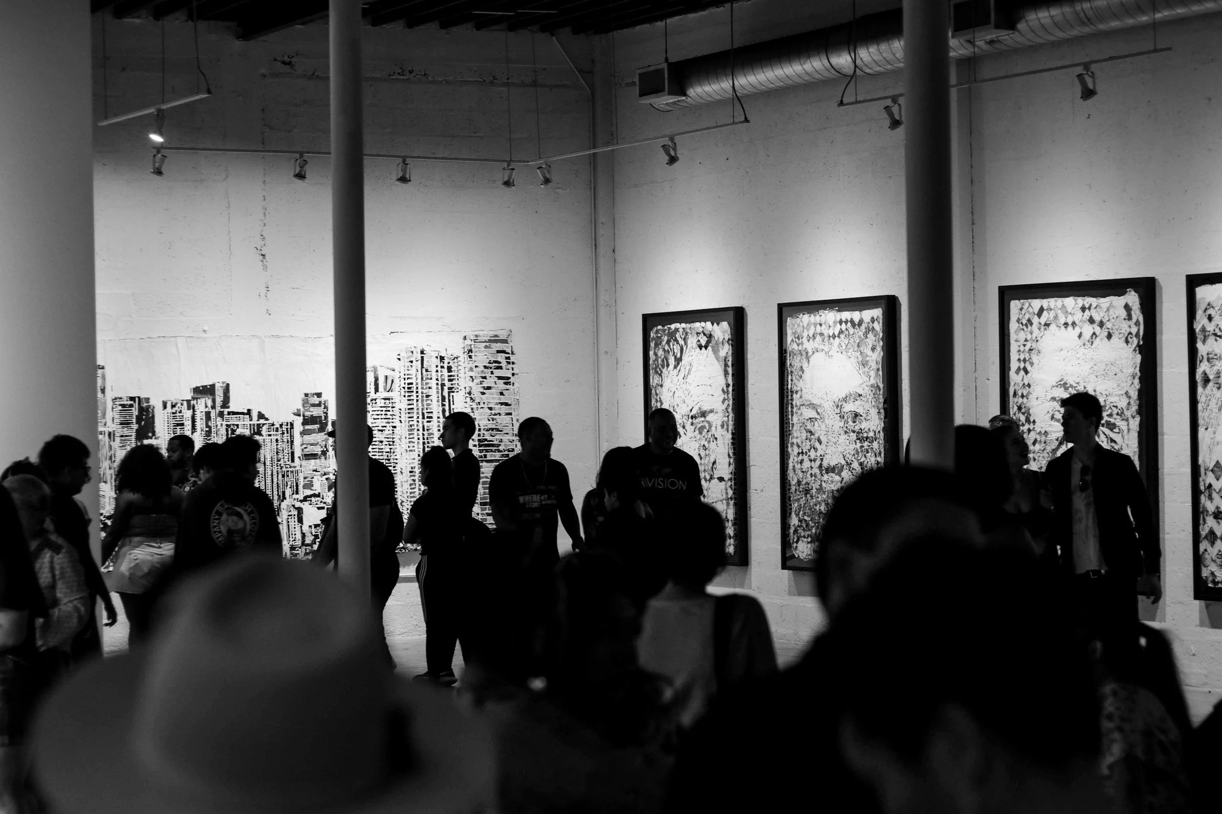
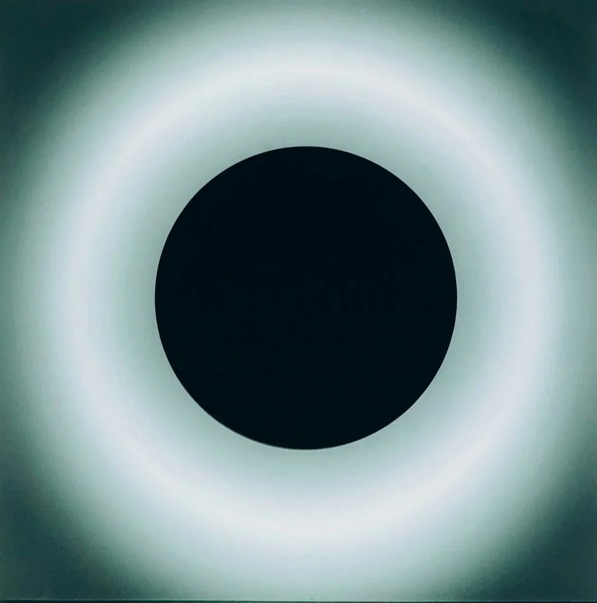
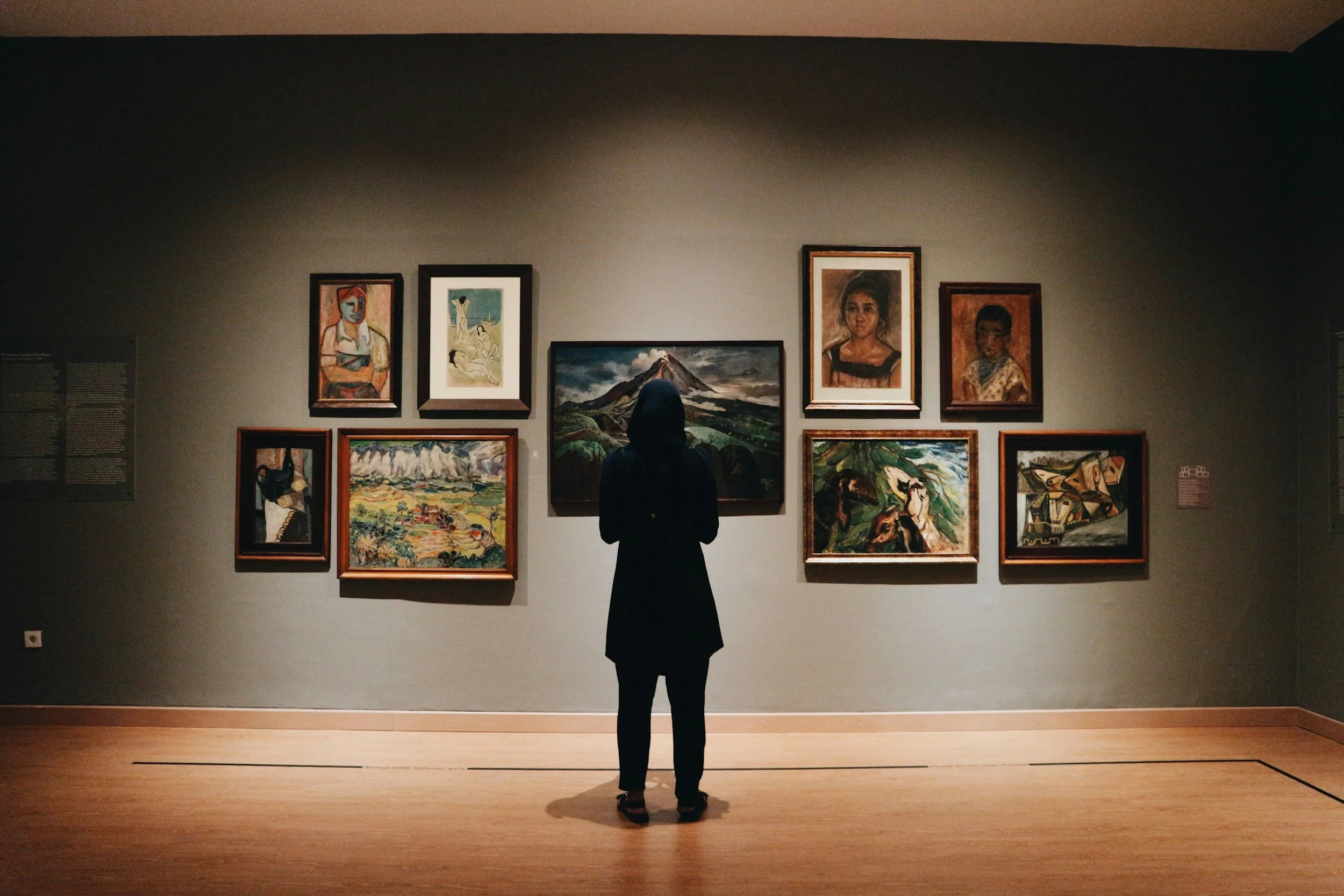
Target Audience: Vivid Vision Studio is designed for people who appreciate contemporary art with clean, intentional design.
Its audience includes creative professionals seeking inspiration, local art collectors interested in discovering emerging artists, and students or aspiring creatives looking to learn, explore, and engage with the local art community. They value originality, quality, and experiences that feel authentic rather than overly commercial.
The Mission: To celebrate emerging artists and create meaningful experiences through exhibitions, workshops, and contemporary art
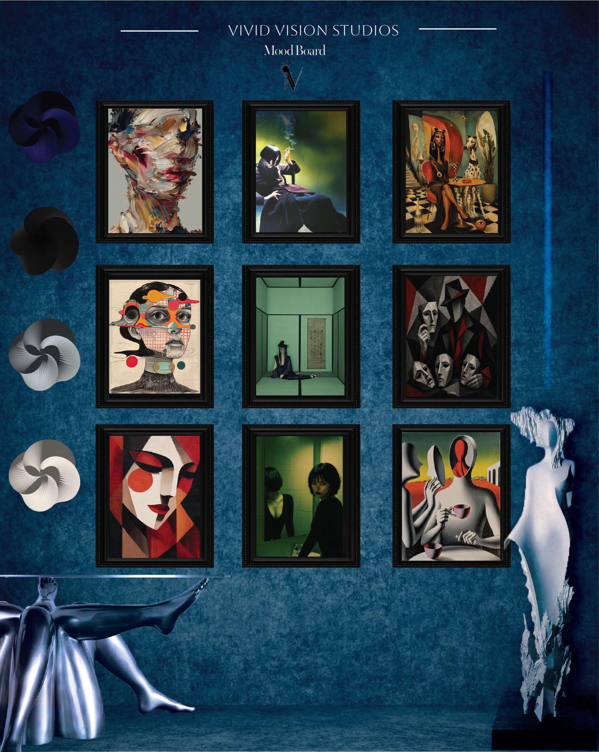
The Visual Direction The visual identity draws inspiration from contemporary galleries and editorial publications, using a restrained design system that lets the artwork take center stage. A structured grid, bold typography, and generous white space create a sense of balance and clarity, while subtle organic elements add warmth and reflect the expressive nature of the artists' work. The result is a visual identity that feels modern, refined, and timeless without competing with the art itself.
logos

primary logo


Secondary logo
Submark logo
Brand
Typefaces
header font

Aboret0
Used for headlines and display text, Aboreto brings an editorial feel to the brand. Its distinctive letterforms create a bold first impression while giving exhibition titles and gallery materials a refined, contemporary look.

subheader font
is used for subheadings to introduce contrast and visual rhythm. Its expressive character softens the structured layout, creating a balanced transition between headlines and body copy.
Warbler Banner

body text
Museo Sans Rounded is used for body text because of its excellent readability and approachable feel. Its rounded forms add warmth to the brand while keeping longer passages clear and easy to read across both print and digital materials.
Museo Sans Rounded
color story
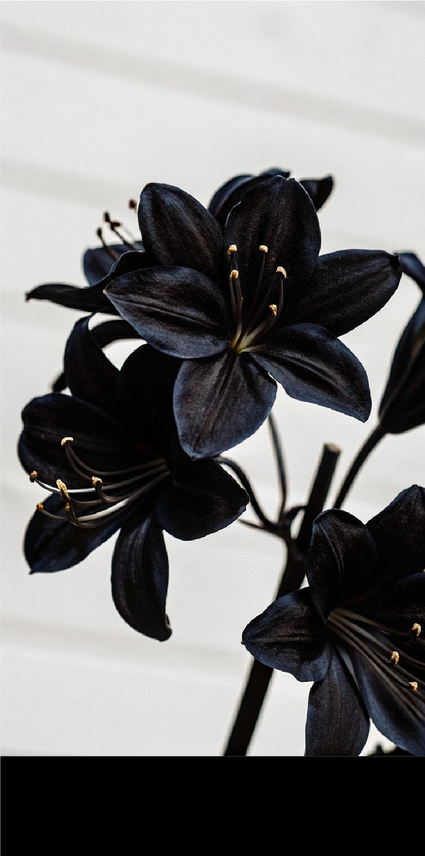
A timeless neutral that creates contrast, establishes hierarchy, and provides a strong foundation for the brand.
black Votaniki
#000000
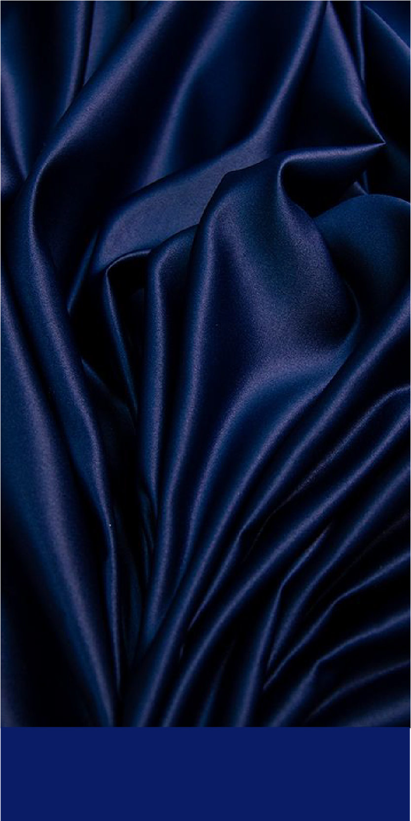
A bold accent used to highlight key information, calls to action, and important design elements while adding depth to the palette.
MIDNIGHT BLUE
#0a1c66
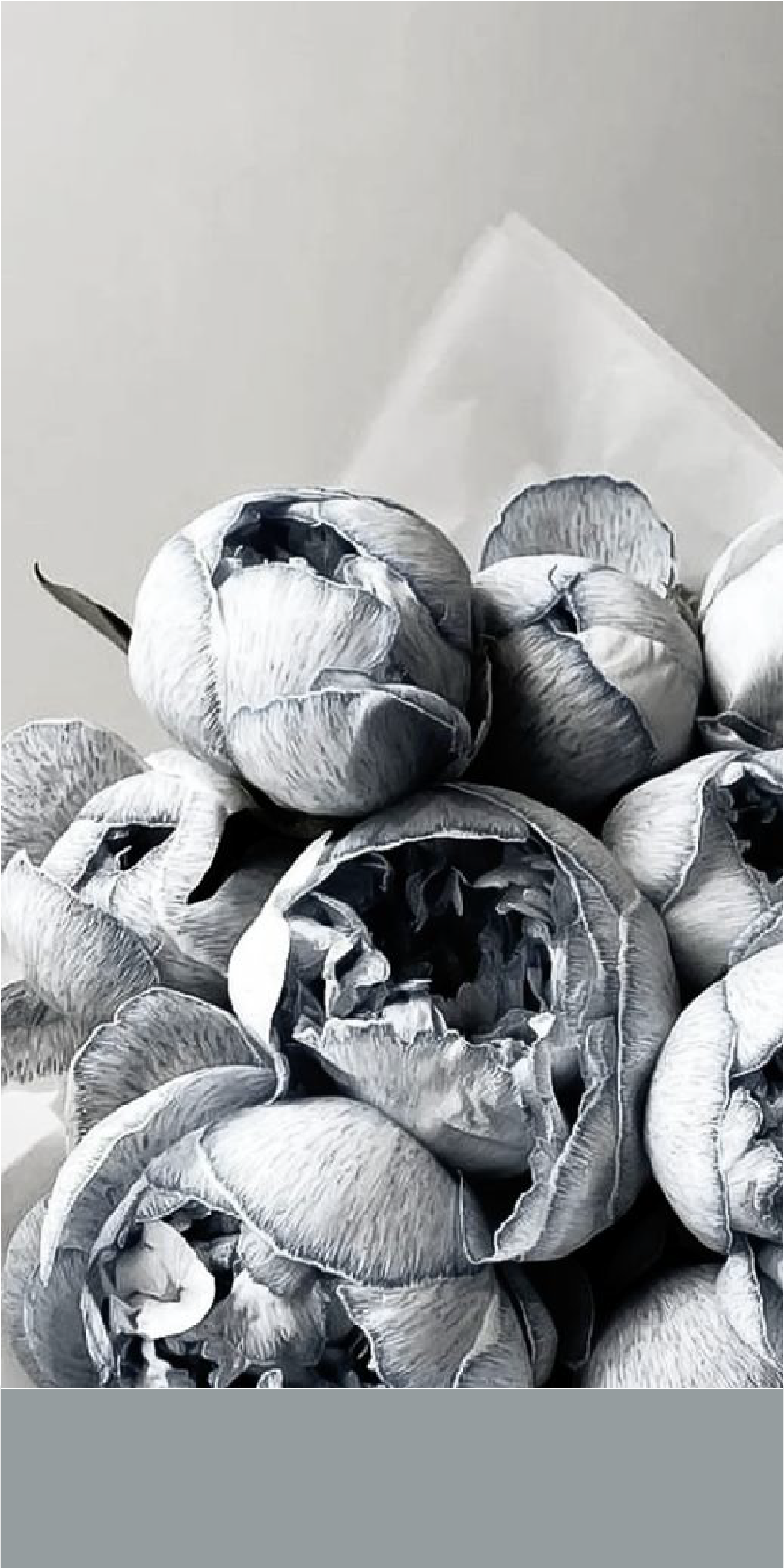
asperitas
#959d9f
A soft gray that brings balance to the identity. It supports the artwork without competing for attention, creating a calm and understated backdrop.
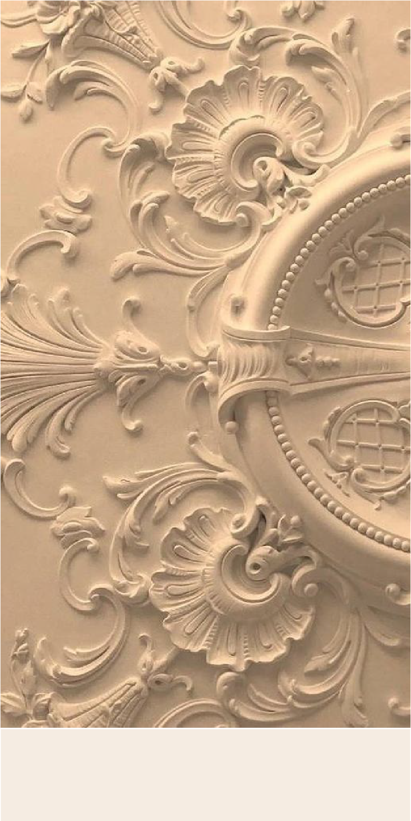
A warm neutral that softens the overall palette and adds a welcoming feel. It provides subtle contrast while allowing the artwork and typography to remain the focus.
antique white
#f5ece2